The Internet took off quicker than anyone would have predicted, growing like crazy. Now, for the past few years, mobile growth has exploded onto the scene. The growth of mobile Internet usage is also far out pacing that of general Internet usage growth.
These days it is hard to find someone who doesn’t own a mobile device, or multiple, connected to the Internet. In the UK there are more mobile phones than people, and should trends continue mobile Internet usage will surpass that of desktop Internet usage within the year.
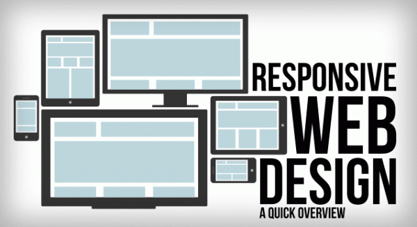
With the growth in mobile Internet usage comes the question of how to build websites suitable for all users. The industry response to this question has become responsive web design, also known as RWD.
Responsive Overview
Responsive web design is the practice of building a website suitable to work on every device and every screen size, no matter how large or small, mobile or desktop. Responsive web design is focused around providing an intuitive and gratifying experience for everyone. Desktop computer and cell phone users alike all benefit from responsive websites.
The responsive web design term itself was coined, and largely developed, by Ethan Marcotte. A lot of what is covered in this lesson was first talked about by Ethan online and in his book Responsive Web Design, which is worth a read.

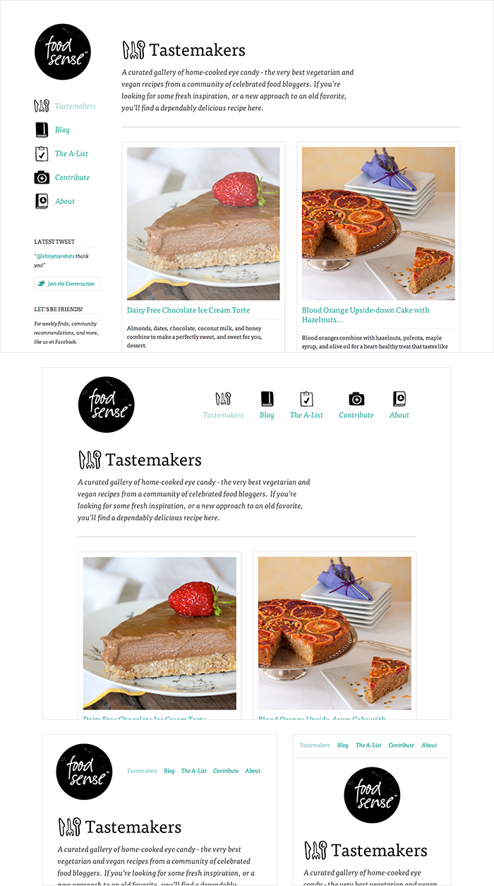
Food Sense has a beautiful website, responsive to all different viewport sizes. No matter how large or small the viewport may be the Food Sense website adjust, creating a natural user experience.
Responsive vs. Adaptive vs. Mobile
For some the term responsive may not be new, and others might be even more acquainted with the terms adaptive or mobile. Which may leave you wondering what exactly is the difference between all of them.
Responsive and adaptive web design are closely related, and often transposed as one in the same. Responsive generally means to react quickly and positively to any change, while adaptive means to be easily modified for a new purpose or situation, such as change. With responsive design websites continually and fluidly change based on different factors, such as viewport width, while adaptive websites are built to a groups of preset factors. A combination of the two is ideal, providing the perfect formula for functional websites. Which term is used specifically doesn’t make a huge difference.
Mobile, on the other hand, generally means to build a separate website commonly on a new domain solely for mobile users. While this does occasionally have it’s place, it normally isn’t a great idea. Mobile websites can be extremely light but they do come with the dependencies of a new code base and browser sniffing, all of which can become an obstacle for both developers and users.
Currently the most popular technique lies within responsive web design, favoring design that dynamically adapts to different browser and device viewports, changing layout and content along the way. This solution has the benefits of being all three, responsive, adaptive, and mobile.
Flexible Layouts
Responsive web design is broken down into three main components, including flexible layouts, media queries, and flexible media. The first part, flexible layouts, is the practice of building the layout of a website with a flexible grid, capable of dynamically resizing to any width. Flexible grids are built using relative length units, most commonly percentages or em units. These relative lengths are then used to declare common grid property values such as width, margin, or padding.
Flexible layouts do not advocate the use of fixed measurement units, such as pixels or inches. Reason being, the viewport height and width continually change from device to device. Website layouts need to adapt to this change and fixed values have too many constraints. Fortunately, Ethan pointed out an easy formula to help identify the proportions of a flexible layout using relative values.
The formula is based around taking the target width of an element and dividing it by the width of it’s parent element. The result is the relative width of the target element.
1 2 |
target ÷ context = result |
Flexible Grid
Let’s see how this formula works inside of a two column layout. Below we have a parent division with the class of container wrapping both the section and aside elements. The goal is to have have the section on the left and the aside on the right, with equal margins between the two. Normally the markup and styles for this layout would look a bit like the following.
HTML
1 2 3 4 5 |
<div class="container"> <section>...</section> <aside>...</aside> </div> |
CSS
1 2 3 4 5 6 7 8 9 10 11 12 13 14 15 16 |
.container { width: 538px; } section, aside { margin: 10px; } section { float: left; width: 340px; } aside { float: right; width: 158px; } |
Fixed Grid Demo
Using the flexible grid formula we can take all of the fixed units of length and turn them into relative units. In this example we’ll use percentages but em units would work equally as well. Notice, no matter how wide the parent container becomes, thesection and aside margins and widths scale proportionally.
1 2 3 4 5 6 7 8 9 10 11 12 13 |
section, aside { margin: 1.858736059%; /* 10px ÷ 538px = .018587361 */ } section { float: left; width: 63.197026%; /* 340px ÷ 538px = .63197026 */ } aside { float: right; width: 29.3680297%; /* 158px ÷ 538px = .293680297 */ } |
Flexible Grid Demo
Taking the flexible layout concept, and formula, and reapplying it to all parts of a grid will create a completely dynamic website, scaling to every viewport size. For even more control within a flexible layout, you can also leverage the min-width, max-width, min-height, and max-height properties.
The flexible layout approach alone isn’t enough. At times the width of a browser viewport may be so small that even scaling the the layout proportionally will create columns that are too small to effectively display content. Specifically, when the layout gets too small, or too large, text may become illegible and the layout may begin to break. In this event, media queries can be used to help build a better experience.
Media Queries
Media queries were built as an extension to media types commonly found when targeting and including styles. Media queries provide the ability to specify different styles for individual browser and device circumstances, the width of the viewport or device orientation for example. Being able to apply uniquely targeted styles opens up a world of opportunity and leverage to responsive web design.
Initializing Media Queries
There are a couple different ways to use media queries, using the @media rule inside of an existing style sheet, importing a new style sheet using the @import rule, or by linking to a separate style sheet from within the HTML document. Generally speaking it is recommend to use the @media rule inside of an existing style sheet to avoid any additional HTTP requests.
HTML
1 2 3 |
<!-- Separate CSS File --> <link href="styles.css" rel="stylesheet" media="all and (max-width: 1024px)"> |
CSS
1 2 3 4 5 6 |
/* @media Rule */ @media all and (max-width: 1024px) {...} /* @import Rule */ @import url(styles.css) all and (max-width: 1024px) {...} |
Each media query may include a media type followed by one or more expressions. Common media types include all, screen, print, tv, and braille. The HTML5 specification includes new media types, even including 3d-glasses. Should a media type not be specified the media query will default the media type to screen.
The media query expression that follows the media type may include different media features and values, which then allocate to be true or false. When a media feature and value allocate to true, the styles are applied. If the media feature and value allocate to false the styles are ignored.
Logical Operators in Media Queries
Logical operators in media queries help build powerful expressions. There are three different logical operators available for use within media queries, including and, not, andonly.
Using the and logical operator within a media query allows an extra condition to be added, making sure that a browser or devices does both a, b, c, and so forth. Multiple individual media queries can be comma separated, acting as an unspoken or operator. The example below selects all media types between 800 and 1024 pixels wide.
1 2 |
@media all and (min-width: 800px) and (max-width: 1024px) {...} |
The not logical operator negates the query, specifying any query but the one identified. In the example below the expression applies to any device that does not have a color screen. Black and white or monochrome screens would apply here for example.
1 2 |
@media not screen and (color) {...} |
The only logical operator is a new operator and is not recognized by user agents using the HTML4 algorithm, thus hiding the styles from devices or browsers that don’t support media queries. Below, the expression selects only screens in a portrait orientation that have a user agent capable of rending media queries.
1 2 |
@media only screen and (orientation: portrait) {...} |
Media Features in Media Queries
Knowing the media query syntax and how logical operators work is a great introduction to m
-1596302495.jpg)


